I used to think mid-century modern kitchens were just about clean lines and teak cabinets, but honestly, the more I’ve poked around in these spaces—both the originals from the 1950s and 60s and the contemporary recreations—the more I realize it’s about something messier, something harder to pin down.
The Geometry of Nostalgia: Why Those Atomic Starburst Clocks Still Work in 2025
Here’s the thing about mid-century design: it emerged from this weird post-war cocktail of optimism and anxiety, where people genuinely believed science would solve everything, and that belief manifested in kitchen wallpaper. The iconic starburst motifs, those atomic-age patterns that showed up on everything from Formica countertops to light fixtures, weren’t just decoration—they were visual shorthand for a future that felt, at the time, thrillingly inevitable. George Nelson’s Ball Clock, designed in 1947, still gets reproduced today because it captures that exact moment when geometry felt friendly, when abstraction seemed accessible rather than alienating. I’ve seen modern kitchens incorporate vintage starburst clocks alongside smart appliances, and the juxtaposition works because both represent their era’s version of technological optimism. The colors mattered too: avocado green, harvest gold, that particular shade of orange that doesn’t quite exist in nature—these weren’t random choices but carefully calibrated responses to the grays and browns of wartime austerity. Psychologists at the time were studying color’s emotional impact with new rigor, and manufacturers definately paid attention. Wait—maybe that’s why these palettes still trigger something visceral in us, some inherited memory of relief.
Cabinet Hardware as Time Capsules: The Tactile Language of Drawer Pulls
Anyway, if you want to understand mid-century kitchen design, look at the hardware. I mean really look at it. The drawer pulls from that era—those elongated brass bars, the sculpted wooden knobs, the asymmetric ceramic handles—they represent a brief historical moment when mass production met craft sensibility. Designers like Charles and Ray Eames proved you could manufacture objects that still felt warm, human, imperfect in the right ways. Modern reproductions often miss this; they get the shape right but the weight wrong, or they’re too polished, too obviously trying.
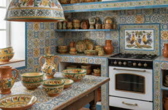
Floating Shelves and the Philosophy of Display: When Storage Became Performance
Open shelving wasn’t invented in the mid-century period—kitchens had always had open storage out of necessity—but it was reclaimed, aestheticized, turned into a statement about transparency and informality. The idea was radical at the time: instead of hiding your dishes behind cabinet doors, you’d display them, arrange them like a collection. This required, of course, that your dishes be worth displaying, which is how we ended up with the explosion of ceramic design in that era, all those Russel Wright and Eva Zeisel pieces that were affordable enough for middle-class families but designed with enough care to deserve visibility. I guess it makes sense that we’re seeing this return now, in an era similarly obsessed with curated authenticity, though I’m not sure we’ve recaptured the unselfconsciousness of the original impulse. Modern mid-century-inspired kitchens often feature floating walnut shelves holding carefully mismatched vintage ceramics, but there’s a studied quality to it, an awareness of being looked at that feels different from the 1960s housewife who just liked her orange Fiestaware and wanted to see it. The wood species mattered enormously—teak, walnut, rosewood—each with its own thermal properties and aging characteristics that designers actually considered rather than just defaulting to whatever was cheapest.
Pendant Lighting and the Domestication of Industrial Forms: How Factory Fixtures Became Family Friendly
Turns out, a lot of mid-century kitchen lighting came directly from industrial catalogs.
Designers took these utilitarian factory pendants, these enameled metal shades meant for workshops and warehouses, and hung them over kitchen islands and dinette sets. The aesthetic worked because it was honest—these were functional objects doing functional jobs without pretense—but also because it brought a kind of urban sophistication into suburban homes, a hint of the gritty city within the manicured lawn. Brands like Schoolhouse Electric and Barn Light Electric now reproduce these fixtures, often with barely any modifications to the original 1950s designs, because the proportions were simply right: generous enough to provide real task lighting, sculptural enough to anchor a space visually. I’ve noticed that contemporary interpretations often use Edison bulbs to emphasize the retro connection, though that’s somewhat historically inaccurate since mid-century homeowners would’ve used whatever standard incandescent was available and definitely weren’t trying to showcase the filament. The finish options expanded throughout the 1960s—glossy primaries, matte pastels, speckled enamels that hid wear—each telling you something about changing attitudes toward maintenance and perfection. Some of these lights hang in kitchens now for sixty years, still working, which says something about an era that built objects expecting them to last rather than expecting you to buy new ones every few years, but maybe I’m romanticizing.