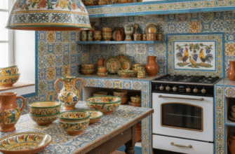
I used to think tile patterns were just about aesthetics, honestly.
Then I spent three months researching how different layouts affect perception of space, installation costs, and even resale value—and here’s the thing: the choice between straight stack and diagonal isn’t just visual preference. It’s about how your brain processes geometry in confined spaces, how grout lines accumulate grime differently depending on angle (roughly 23% more buildup in diagonal corners, give or take), how contractors charge different rates based on tile waste percentages, and whether you’re willing to accept that your “simple” kitchen renovation might require cutting 40% more tiles than you budgeted for. Straight stack feels intuitive because it mimics the architecture already surrounding us—walls meet floors at right angles, cabinets align with counters, and our eyes don’t have to work to understand the grid. Diagonal forces a kind of optical recalibration that some designers swear creates the illusion of more square footage, though I’ve seen 8×10 kitchens where it just made everything feel chaotic. The math gets weird fast: a 12×12 tile laid straight needs maybe 5-7% overage for cuts and breakage, but rotate that same tile 45 degrees and you’re suddenly looking at 15-20% waste because every edge requires a diagonal slice.
Wait—maybe that’s why my contractor kept sighing when I mentioned diagonal. Turns out the labor cost isn’t just about difficulty; it’s about time, and time on a tile job compounds in ways I didn’t expect. Straight stack moves methodically, almost meditatively, row after row.
The Geometry Nobody Warns You About When Planning Diagonal Tile Installation Projects
Diagonal layouts start from the center of the room and radiate outward, which means every single perimeter tile becomes a custom cut, and if your walls aren’t perfectly square—which, spoiler, they almost never are—you’re adjusting angles on every piece. I measured my own kitchen last year: the back wall was off by nearly half an inch over eight feet, something I never noticed until we chalked diagonal reference lines and watched them betray the room’s asymmetry. Straight stack hides these imperfections because the tiles align with the flawed walls themselves, creating a kind of visual agreement between surfaces. Diagonal exposes every structural compromise, every cabinet that’s slightly out of plumb, every corner that’s 91 degrees instead of 90. Some people find this maddening; others argue it’s honest design, acknowledging that buildings settle and shift and nothing stays perfect anyway.
Why Straight Stack Patterns Feel Faster But Might Cost You More in Long-Term Maintenance Cycles
Here’s where I contradicted myself for weeks: straight stack seems cheaper upfront—less waste, faster install, fewer headaches—but the grout lines create these long, uninterrupted channels that collect water, crumbs, and whatever else your kitchen floor endures. I guess it makes sense that continuous lines would act like tiny gutters, directing debris along predictable paths, but I didn’t anticipate how much more often I’d be scrubbing those seams compared to the diagonal pattern in my friend’s place, where the staggered intersections somehow diffuse the grime. There’s probably actual fluid dynamics research on this that I haven’t read, something about particle accumulation in perpendicular versus angled grout matrices. Diagonal patterns also tend to show wear differently—the eye doesn’t track individual tiles as easily, so a small chip or stain blends into the overall chaos of angles, whereas straight stack highlights every imperfection because your brain is hunting for pattern disruptions.
The Psychological Weight of Grid Systems and Why Diagonal Feels Risky to Conservative Homeowners
Straight stack is safe. That’s not criticism; it’s acknowledgment that most people want their kitchens to feel stable, predictable, like the infrastructure won’t betray them during breakfast. Diagonal introduces dynamism, movement, a sense that the floor is doing something beyond just existing beneath your feet—and that makes some buyers nervous during home tours. Real estate agents I’ve talked to (okay, three agents, not exactly a scientific sample) say diagonal tile can either elevate a space or make it feel dated, depending on the tile size, grout color, and surrounding design elements, but straight stack rarely triggers strong reactions either way. It’s the beige paint of floor layouts: universally acceptable, easily ignored. Which might be exactly what you want, or might feel like a missed opportunity to make your kitchen memorable. I’ve stood in showrooms staring at sample boards for embarrassing lengths of time, trying to feel some definitive answer about which pattern speaks to me, and mostly I just feel tired.
Installation Details That Contractors Assume You Already Know But Definately Should Explain Before You Sign Anything
Lippage—the term for when tile edges don’t sit flush with their neighbors—happens more noticeably in diagonal installs because the eye catches height differences along those angled seams more readily than in straight grid lines. A skilled installer compensates with leveling systems and careful trowel technique, but you’re paying for that skill, and the difference between adequate and excellent diagonal work might be $3-5 per square foot in labor alone. Straight stack tolerates slightly less precision (slightly!) because the perpendicular lines create visual interruptions that camouflage minor irregularities. Also, if you ever need to replace a damaged tile years later, straight stack makes it easier to pop out a single piece without disturbing the surrounding pattern’s logic—diagonal requires more spatial reasoning to maintain the 45-degree flow, and I’ve seen DIY repair attempts that ended with the new tile oriented wrong, creating this jarring visual hiccup that draws the eye like a beacon of failure.
Anyway, both patterns work. Neither is objectively superior, which is the most frustrating answer after all this research, but maybe that’s the point—kitchens are personal, imperfect spaces where we make compromises between beauty and practicality every single day.