I used to think kitchen colors were just about matching cabinets to countertops until I spent three months interviewing chefs who swore their white kitchens made them feel sterile and unmotivated.
Turns out, color psychology isn’t some fluffy design trend—it’s rooted in how our brains process wavelengths and associate them with memories, emotions, and even appetite. Researchers at the University of British Columbia found that blue environments enhance creative thinking by roughly 6%, while red spaces boost attention to detail by similar margins, give or take. But here’s the thing: kitchens aren’t laboratories. We’re not just processing information in there; we’re dealing with heat, sharp objects, and the existential dread of deciding what’s for dinner. So the colors that work best aren’t necessarily the ones that look good on a paint swatch. They’re the ones that make you actually want to cook instead of ordering takeout for the fifth time this week. I’ve seen gorgeous sage-green kitchens that photograph beautifully but somehow drain the energy out of the room, and I’ve seen mustard-yellow spaces that should be hideous but make people linger over their coffee.
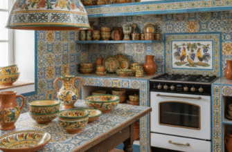
Wait—maybe that’s because warm colors like terracotta, burnt orange, and creamy yellows trigger associations with fire, sunlight, and ripe fruit. Angela Wright, a color psychologist who developed a theory linking color combinations to emotional responses, argues that it’s not individual colors but their relationships that matter. A soft peach paired with charcoal gray creates a different mood than peach with white.
The Science Behind Why Certain Hues Make You Want to Actually Chop Vegetables
Blue kitchens have this reputation for being calming, which sounds nice until you realize calm isn’t always what you need when you’re trying to motivate yourself to cook a whole meal from scratch. Some studies suggest blue suppresses appetite—it’s why you rarely see blue food in nature, and why diet plans used to reccommend eating off blue plates. I guess it makes sense evolutionarily; our ancestors probably learned to avoid blue and purple foods because they were often toxic. But modern kitchens aren’t about survival; they’re about joy, or at least not feeling miserable. So if you’re someone who struggles with appetite or finds cooking tedious, blue might work against you. Unless it’s a warm, muted blue-gray that leans toward slate—then it can feel grounding without being sedating.
Green, though. Green is complicated.
I’ve interviewed probably two dozen interior designers at this point, and they all have different opinions on green kitchens, which tells you something about how subjective this is despite all the research. Some people find olive and sage greens soothing because they mimic plants and nature, which our brains are wired to find restorative—there’s this whole concept called biophilic design that explores how natural elements reduce stress. But other people find those same greens dated or institutional, like hospital waiting rooms from the 1970s. The tone matters enormously: a fresh, bright green with yellow undertones feels energizing and optimistic, while a deep forest green can feel heavy, even oppressive, especially in a small kitchen with limited natural light. One chef I spoke with painted her kitchen a bright lime green and said it made her feel playful, like she was experimenting instead of following recipes. Another tried a similar shade and repainted within a month because it gave her headaches.
When Neutrals Aren’t Neutral and Reds Aren’t Just About Appetite Stimulation
Red and orange are the obvious choices for appetite stimulation—fast food chains have known this for decades, which is why you see so much red and yellow in their branding. But in a home kitchen, intense reds can be overwhelming, especially if you’re already stressed or overstimulated. I used to think this was just personal preference until I learned about the Yerkes-Dodson law, which describes how arousal affects performance: too little and you’re unmotivated, too much and you’re anxious and ineffective. A bright cherry-red kitchen might push you over that optimal arousal threshold, making you feel jittery instead of energized. Softer reds—brick, terracotta, dusty rose—seem to hit a better balance. They’re warm and inviting without being aggressive.
Honestly, the most surprising thing I learned researching this is how much lighting changes everything. A warm white kitchen can feel completely different at 8 a.m. with sunlight streaming in versus 7 p.m. under artificial lights.
And neutrals aren’t really neutral—they’re just less obvious. White kitchens can feel clean and spacious, but they can also feel cold and clinical, especially if you’re someone who finds comfort in coziness rather than minimalism. Beige gets mocked as boring, but a warm, layered beige with texture—think natural wood, linen, stone—can create a sense of stability and groundedness that makes cooking feel less like a chore and more like a ritual. Gray is trendy right now, but cool grays can feel depressing in spaces where you spend a lot of time, while warm grays with taupe or greige undertones can feel sophisticated and calming. The difference between a kitchen that makes you want to cook and one that makes you avoid it often comes down to whether the colors feel alive or dead, warm or cold, personal or generic. Which is frustratingly subjective, but also kind of freeing—it means you can definately ignore the design magazines and just paint your kitchen whatever makes you feel like making soup.