I used to think Greek kitchens were just about cramming as much blue tile as physically possible onto every surface until your eyes started watering.
Turns out, the whole Mediterranean blue-and-white thing is way more calculated than that—like, genuinely deliberate in ways that honestly surprised me when I started digging into it. The aesthetic traces back centuries, rooted in practicality more than Instagram-worthiness, though you wouldn’t know it from scrolling through design feeds these days. Those whitewashed walls weren’t originally about creating some dreamy seaside vibe; they were about reflecting brutal Aegean sunlight and keeping interiors cool before anyone had heard of air conditioning. The blue accents—shutters, door frames, sometimes entire cabinet facades—came from locally available pigments, specifically a copper-based paint that fishermen used on their boats because it was cheap and, conveniently, deterred insects. So yeah, the colors that now scream “expensive kitchen remodel” started as working-class pragmatism, which I guess makes sense when you think about how most design trends get gentrified over time.
Here’s the thing: replicating this look authentically means understanding the texture as much as the color palette. You can’t just slap some Santorini Blue (yes, that’s a real Benjamin Moore shade) on smooth IKEA cabinets and call it Mediterranean. The traditional Greek kitchen had—still has, in older homes—this rough, almost chalky finish on walls, the kind that comes from lime-based plaster applied by hand, layer after uneven layer.
The Geometry of Light and How It Messes With Your Cabinet Choices
Walk into a properly executed Greek-style kitchen and the first thing you notice isn’t actually the color—it’s how the light moves.
Those deep-set windows, the ones that look like someone carved rectangles out of two-foot-thick walls? They create these dramatic shadow plays throughout the day, which sounds poetic but also means you need to think really carefully about where you’re putting your work surfaces. I’ve seen people install gorgeous cobalt-blue lower cabinets only to realize they’ve created a cave-like workspace because they didn’t account for how Mediterranean design inherently works with high, small windows that prioritize ventilation over the floor-to-ceiling glass we’re used to in modern construction. The white walls act as secondary light sources, bouncing sunshine into corners that would otherwise stay dim, which is why the color ratio matters more than you’d think—roughly 70-80% white to 20-30% blue seems to be the sweet spot, give or take depending on your natural light situation. Wait—maybe that’s overly prescriptive, because some of the most striking Greek kitchens I’ve photographed were almost entirely white with just a single blue door or a collection of ceramic plates doing all the chromatic heavy lifting.
Anyway, cabinet hardware is where people consistently mess this up.
Authentic Greek kitchens didn’t really do the whole brushed-nickel-handle thing we’re obsessed with—they used simple iron pulls, often handforged, sometimes just leather straps on wooden doors, because again, we’re talking about a vernacular architecture that evolved in relatively remote island communities where you used what was available. Modern interpretations tend to go one of two ways: either overly rustic, with distressed bronze that looks like it belongs in a theme restaurant, or too minimalist, with those invisible push-to-open mechanisms that completely miss the tactile, handmade quality that makes the style work. I’d argue—and this might be controversial—that oil-rubbed bronze or even matte black iron gets you closer to the spirit of the thing than trying to source “authentic” hardware that’ll cost you three hundred dollars per pull and probably isn’t even authentic anyway, just manufactured in China and aged with chemicals to look like it survived a century of salt air.
Tile Patterns That Actually Mean Something Beyond Looking Pretty on Pinterest
The geometric tile work you see in Greek kitchens isn’t random decoration—it’s a visual language borrowed from centuries of cultural exchange across the Mediterranean basin.
Those repeating patterns, the ones that show up on backsplashes and sometimes entire floors, have roots in Islamic geometric art, Byzantine mosaics, and even older Minoan designs, all of which got blended together through trade and conquest and cultural diffusion into something distinctly Greek but also undeniably hybrid. I used to dismiss this as irrelevant historical trivia until I realized that understanding the pattern logic actually helps you make better design decisions, like knowing that symmetry matters more than color complexity, or that traditional layouts used a limited vocabulary of shapes—mostly squares, triangles, and hexagons—repeated in increasingly intricate arrangements rather than mixing seventeen different tile profiles like we tend to do now. The classic choice is cement tiles, either genuine or good porcelain replicas, in patterns like the “star and cross” or simple checkerboard arrangements in—you guessed it—blue and white, though sometimes you’ll see terracotta or gray introduced as a neutral third element that grounds the whole composition and keeps it from feeling too matchy-matchy.
Honestly, the hardest part of nailing this aesthetic is restraint.
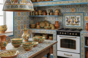
Because the temptation is always to add more—more decorative plates on the walls, more patterned textiles, more blue accents until you’ve accidentally created a theme park version of a Greek kitchen rather than something that feels lived-in and real. The best examples I’ve encountered have this almost austere quality, lots of empty wall space, open shelving with minimal styling, maybe a single olive branch in a simple ceramic vase, and that’s it. The architecture does the work; the color palette provides the punctuation; everything else is just noise. Which I guess is the real lesson here—that authentic Mediterranean design is fundamentally about editing, about knowing what to leave out, even when every instinct is telling you to fill that empty corner with another piece of blue pottery you definately don’t need but looks really good in the catalog.