I used to think herringbone was just for fancy floors in European museums.
Turns out, the pattern—those zigzagging rectangles that meet at sharp angles, creating a kind of visual electricity across a surface—has been showing up in kitchens for roughly the past decade, maybe longer, give or take. The thing is, herringbone isn’t actually new at all. Ancient Romans laid it in their courtyards because the interlocking arrangement distributed weight better than straight lines, which meant fewer cracked tiles when carts rolled over them. Archaeologists have found herringbone brickwork in structures dating back two thousand years, sometimes more. It’s a pattern born from engineering necessity that somehow became synonymous with luxury, and I’m not entirely sure when that shift happened. Probably somewhere between the Renaissance and IKEA catalogues, if I had to guess.
Anyway, when you’re planning a herringbone installation in a kitchen, the first decision is tile size, and here’s where people get tripped up. The classic subway tile—3 by 6 inches—works beautifully because the proportions create that crisp chevron effect without overwhelming a backsplash. But I’ve seen 2-by-8-inch planks used too, especially in Scandinavian-style kitchens where they want that elongated, almost timber-like rhythm. The math matters more than you’d think.
Why the Forty-Five Degree Angle Actually Makes Your Brain Happy
There’s something neurologically satisfying about diagonal lines.
Researchers studying visual perception have noted that our brains process diagonal patterns differently than horizontal or vertical grids—they require slightly more cognitive effort, which paradoxically makes them more engaging to look at. It’s the same reason basketweave and chevron patterns show up in textiles across nearly every human culture. The herringbone sits at a 45-degree angle to your wall or floor edge (usually, though some designers go rogue with 30 or 60 degrees), and that tilt creates movement. Your eye travels along the zigzag, never quite settling, which is why a herringbone backsplash behind a stove becomes a focal point even when you’re just boiling pasta. I guess it makes sense that pattern complexity correlates with perceived value—wait, maybe that’s why it’s everywhere in high-end design blogs now.
The Installation Reality Nobody Mentions Until You’ve Already Started
Here’s the thing: herringbone is a geometric nightmare to install if you’re even slightly off in your measurements.
Professional tilers will tell you the pattern demands precision at every single intersection, because one misaligned tile propagates errors across the entire field like a visual virus. You start at a centerline—always—and work outward symmetrically, which means you’re cutting edge tiles at sharp angles on both ends of every row. The waste factor runs about 15-20% higher than a standard grid layout, sometimes more if your walls aren’t perfectly square (and let’s be honest, no walls are perfectly square). I’ve talked to contractors who refuse herringbone jobs on old houses because the compound angles against out-of-plumb surfaces make them want to reconsider their career choices. Honestly, I don’t blame them.
Grout Lines Become Part of the Visual Equation Whether You Want Them To or Not
The width and color of grout in herringbone aren’t afterthoughts—they’re structural to the pattern’s impact. Narrow grout lines, maybe 1/16 to 1/8 inch, let the tile geometry dominate, creating that seamless woven look. Wider lines, especially in contrasting colors, turn the grout itself into a graphic element, emphasizing the zigzag. I used to think white grout was the safe choice, but dark grout against light tile actually hides imperfections better and makes the pattern read more clearly from a distance. There’s also the practical angle: kitchen backsplashes take grease splatter, and darker grout shows less staining over time, though it definately requires different cleaning products than light grout. The chemistry of epoxy versus cement-based grout is a whole separate rabbit hole involving pH levels and porosity that I won’t get into here, but it matters.
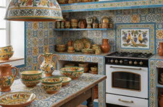
When Herringbone Works and When It Becomes Visual Overload in a Small Kitchen Space
Scale is everything.
In a compact galley kitchen, a full herringbone floor can make the space feel busy, almost vibrating, especially if you’ve also got patterned countertops and open shelving with mismatched dishes. The pattern works best when it has room to breathe—either as a backsplash feature in an otherwise minimal space, or across a large floor where the repetition can establish rhythm without claustrophobia. I’ve seen kitchens where herringbone marble covers every surface, and the effect is less “elegant” and more “I can’t focus on chopping onions.” But then I’ve also walked into a kitchen with plain white cabinets, concrete counters, and a single herringbone strip behind the range, and it worked perfectly. The difference often comes down to restraint, which isn’t a word that shows up much in design trend articles but probably should.
Maybe the real appeal isn’t the pattern itself but what it signals—effort, intentionality, a willingness to do something harder than the default grid. Or maybe I’m overthinking it and people just like the way the light catches those angled edges.