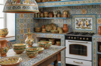
I used to think subway tile was boring.
Then I spent three months renovating a 1920s bungalow in Portland, and I found myself standing in the tile aisle at a supplier, holding a single white rectangle, trying to figure out why this shape—3 by 6 inches, nothing fancy—had survived a hundred years of design trends. The guy next to me was buying geometric hexagons for his bathroom. The woman behind me had a cart full of Moroccan zellige. And here I was, gravitating toward the same tile pattern that lined New York City subway stations in 1904, the same one my grandmother had in her kitchen, the same one that shows up in roughly 60 percent of the renovation blogs I’ve bookmarked over the years, give or take.
Turns out, there’s a reason for that.
Subway tile isn’t just durable—it’s weirdly adaptable. The classic running bond pattern, where each tile is offset by half its length, creates this horizontal rhythm that makes walls feel wider. I’ve seen it in farmhouse kitchens with white grout, in industrial lofts with dark gray grout an inch wide, in maximalist spaces where the tile itself is cobalt blue or forest green. The pattern stays the same, but the vibe shifts completely depending on how you style it.
Why the Running Bond Pattern Actually Works in Real Kitchens (Not Just Pinterest)
Here’s the thing: most people don’t realize the running bond layout has practical advantages beyond aesthetics.
The offset pattern distributes stress across the wall more evenly than a stacked grid, which matters if you live somewhere with settling foundations or temperature swings. I learned this the hard way when I tried to do a straight stack pattern in my last rental—the grout lines cracked within six months because every seam lined up vertically, creating weak points. The running bond avoids that by staggering the joints. It’s the same principle used in bricklaying, which makes sense considering subway tile was originally designed to mimic the look of brick but at a fraction of the cost. The ceramic glaze also made it easier to clean than porous brick, which was crucial in early 1900s public transit systems where hygiene was becoming a big deal. Coal soot, grime, crowds—those subway stations needed surfaces that could be hosed down, and the tile’s glossy finish did exactly that.
Plus, installation is straightforward enough that even semi-competent DIYers can manage it. You start with a level line, work your way up, and use spacers to keep everything consistent. I’m not saying it’s easy—I definately spent an entire Saturday cursing at corner cuts—but it’s more forgiving than herringbone or basket weave, where one mistake throws off the entire pattern.
The Grout Decision That Nobody Warns You About Until It’s Too Late
Grout color is where people mess up.
I used to think white tile meant white grout, but that’s how you end up with a backsplash that looks dingy within a year unless you’re the kind of person who enjoys scrubbing grout lines every weekend. Dark grout—charcoal, black, even a deep gray—hides stains and adds contrast, which can make the tile pattern pop more. But here’s the catch: if you go too dark, the grout lines become the dominant visual element, and suddenly your classic backsplash feels busy. I’ve seen kitchens where the grout was nearly as wide as the tile itself, and it looked more like a grid than a backsplash. The sweet spot, at least in my experiance, is somewhere between 1/8 and 1/4 inch, with a grout color that’s one or two shades off from the tile. Not matchy-matchy, but not jarring either.
And then there’s the question of whether to use sanded or unsanded grout, which depends on the width of your grout lines, but honestly, most tile stores will tell you that part if you ask. What they won’t tell you is that epoxy grout is worth the extra cost if you’re installing behind a stove, because it resists staining and doesn’t need sealing. I didn’t know that during my first kitchen reno, and I spent two years looking at a yellowish discoloration near the range that no amount of cleaning could fix.
When Classic Subway Tile Stops Being Classic and Starts Being Something Else Entirely
Wait—maybe this is where the whole “timeless” argument falls apart a little.
Subway tile is classic until everyone has it, and then it becomes the design equivalent of a white t-shirt. Functional, sure. Versatile, absolutely. But at some point, you start wondering if you’re playing it too safe. I guess that’s why I’ve been seeing more people mess with the formula lately—vertical stacking instead of horizontal, larger formats like 4 by 8 or 4 by 12, textured surfaces instead of glossy. Some designers are even doing a thing where they mix subway tile with smaller mosaics or accent strips, which can look incredible or chaotic depending on execution. The running bond pattern itself stays recognizable, but the scale and finish change just enough to feel fresh.
Honestly, I think that’s the real appeal. It’s a framework, not a rule. You can follow it exactly and get something that feels grounded and familiar, or you can tweak it just slightly and end up with something that still nods to tradition but doesn’t feel like you copied it straight from a 2015 Joanna Gaines episode. Either way, you’re working with a pattern that’s been tested for over a century, which is more than you can say for most design trends.